
Dominion Energy
Designing and driving adoption of a component-based design system
Role
Lead designer
Deliverables
UI Design, Design Documentation, Component Library, Dark Theme/Light Theme
Team
Product Manager
4 Engineers
Overview
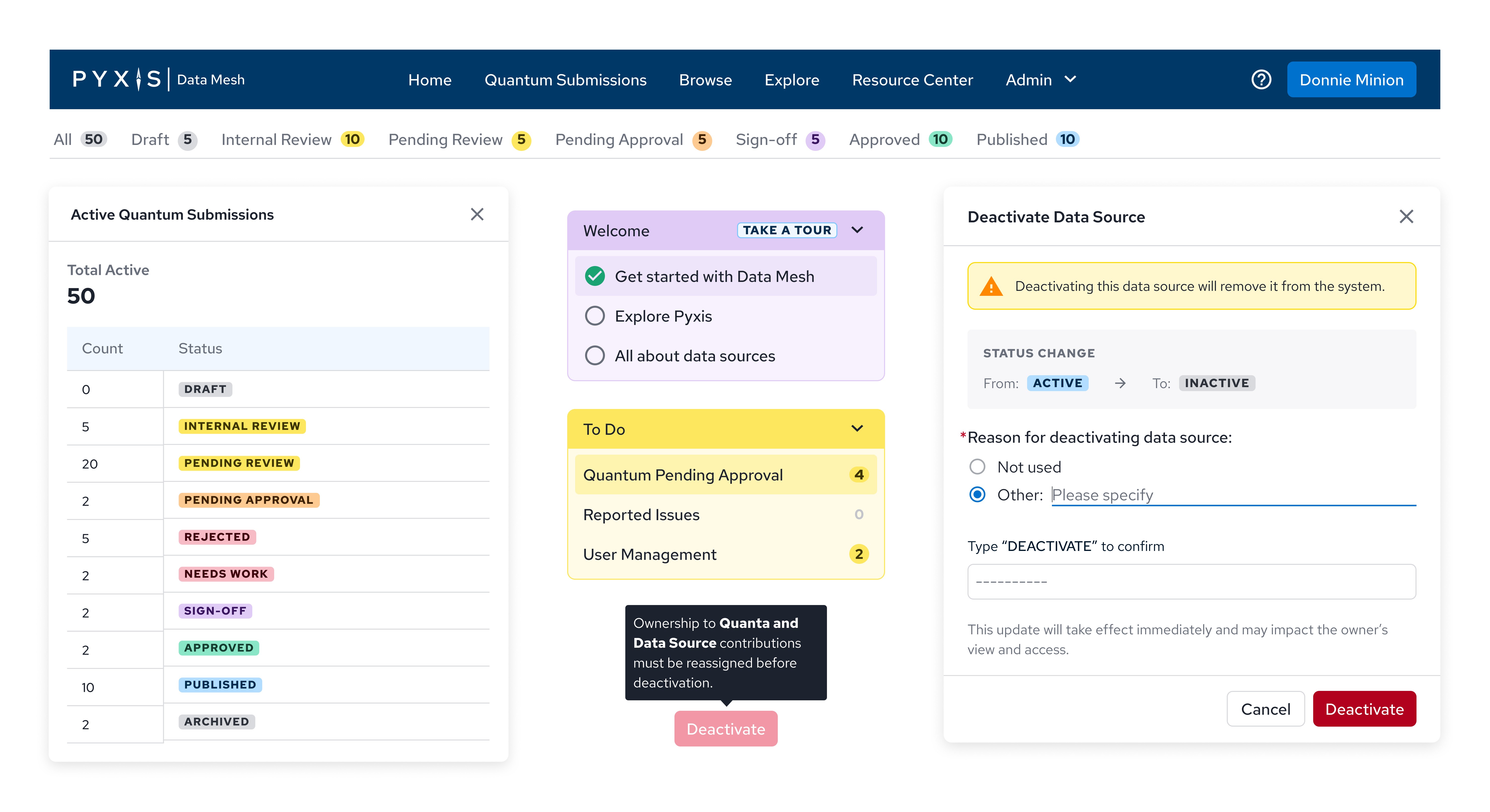
When I first joined the team working with Dominion Energy, the design culture was at its beginning stages. The focus was more on producing workflow solutions rather than fully refining designs. Final designs utilized old components from Dominion Energy's legacy products and had limited functionality and UI styles.
As the product grew, we needed a system to establish and elevate the UI of the past, current, and future designs.
I joined the project halfway when the team's current designer went on maternity leave. Early into the project, I saw the opportunity to advocate and drive the adoption of a design system. There was a large need to establish a shared language between design and engineering as ambiguities surfaced.
Old Verses New
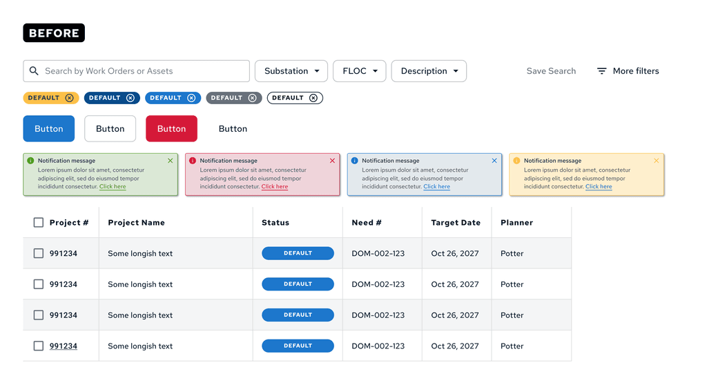
I ran an audit by collecting and documenting existing components from their legacy libraries in Figma and Storybook. Many of these components had limited functionality and variants of different sizes with no usage guidelines. Using Google Sheets, I grouped components into categories: text styles, colors, icons, buttons, navigation, notifications, cards, lists, and other common UI categories, making it easier to remove unnecessary styles and merge similar components.
With all of these changes happening, I worked with development collaboratively to build channels of communication across Jira and Slack to map outdated styles and components to new ones.
Solidfying Visual Foundations
Color
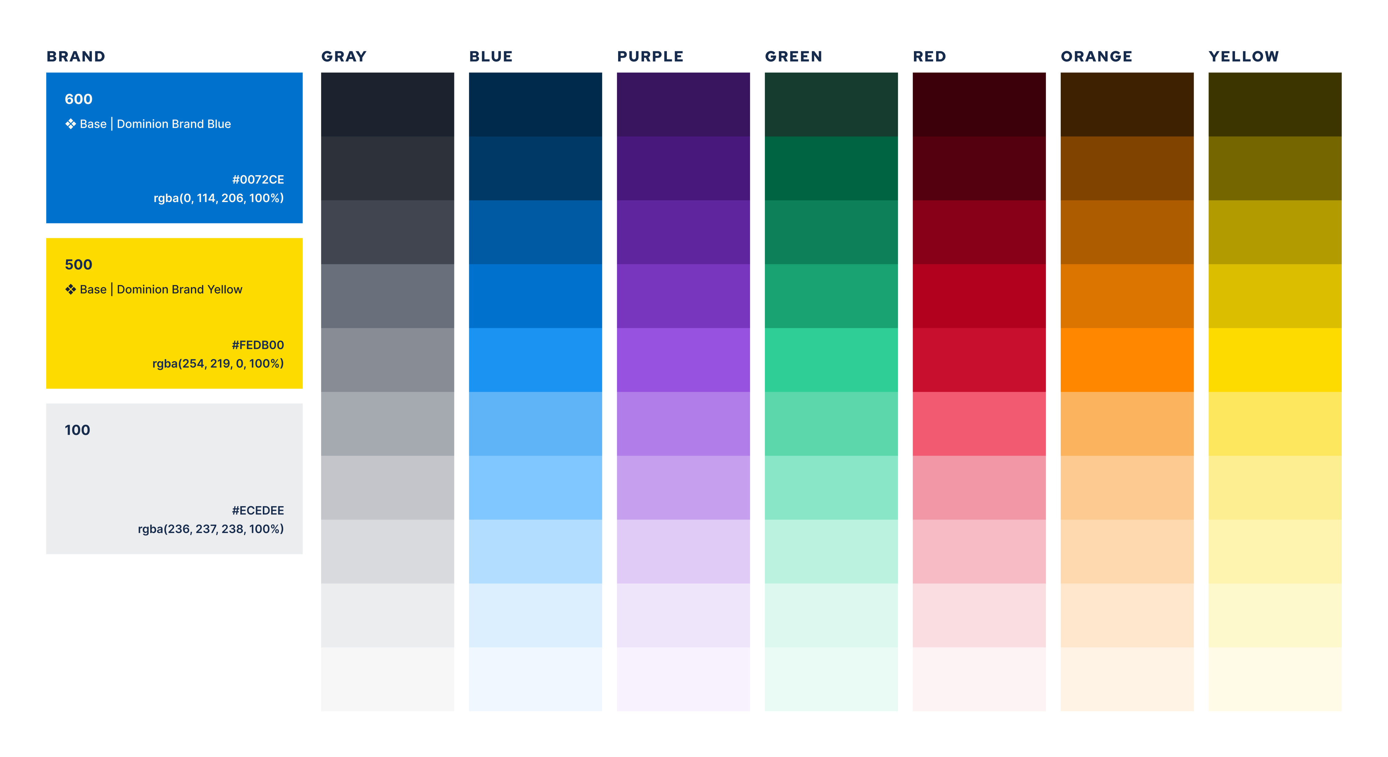
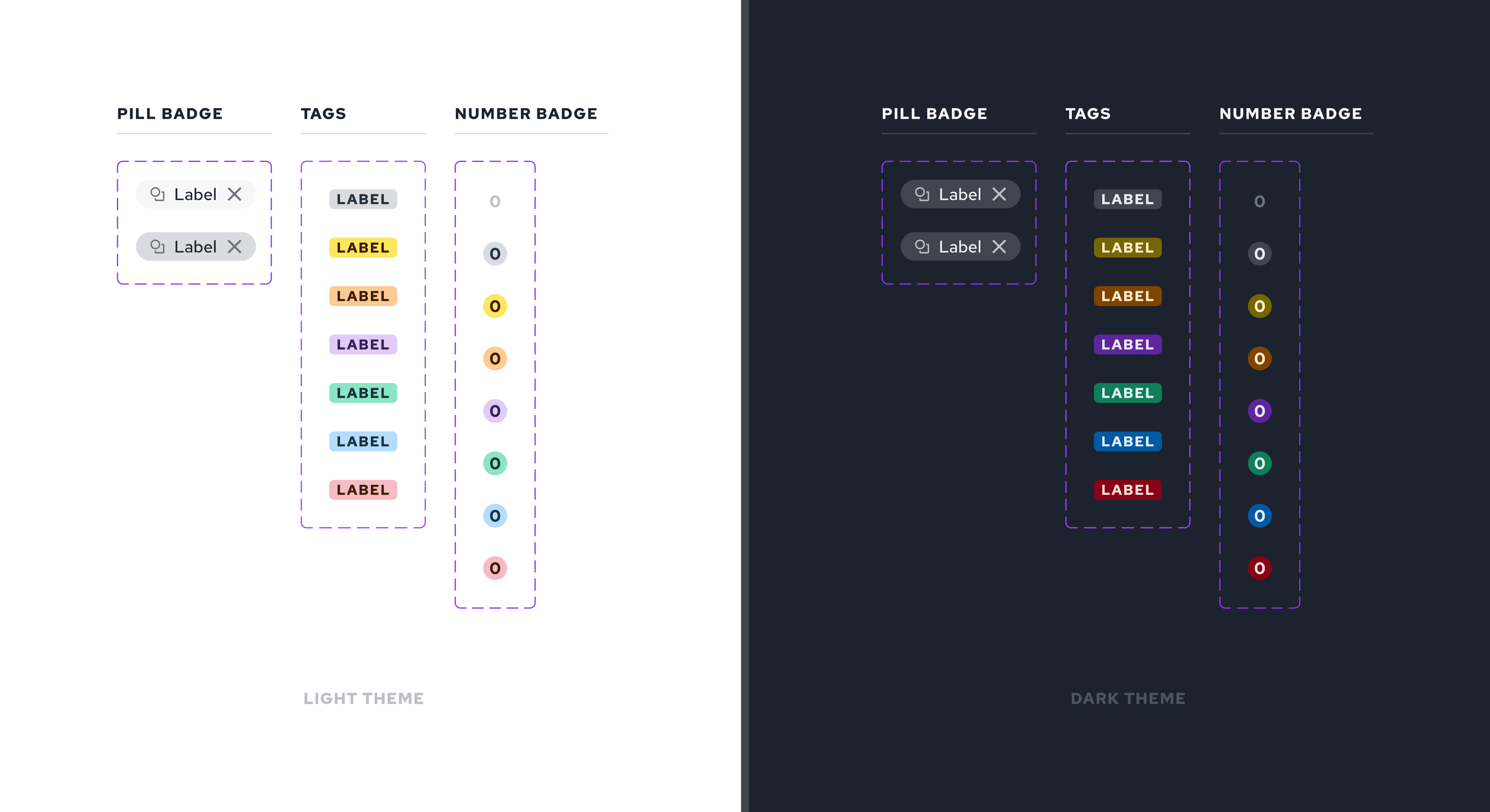
Part of Constellation's visual foundation update was to incorporate interaction states like hover and system the color system seen frequently in tag and badge components. To do so required an expanded color palette in neutrals, brand, and accent colors. I pulled primary brand colors from Dominion's Energy brand guide and followed Tailwind's naming convention to easily switch between dark theme and light theme down the line. Communicating with the lead developer, semantically named tokens were the next line of effort to be adopted.
Typography
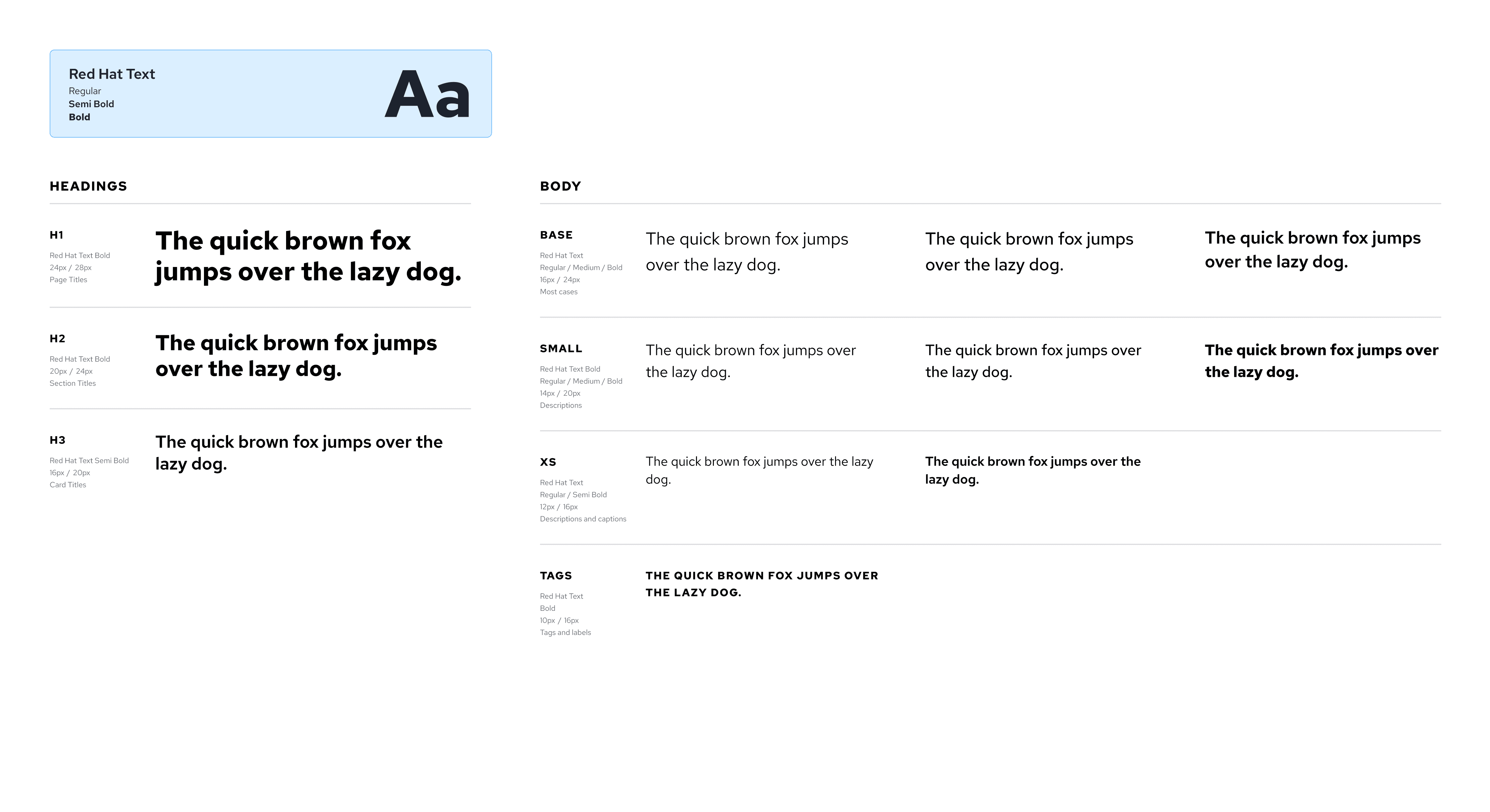
There were numerous text styles from their legacy web and mobile products, so I reduced the text styles from 41 to 15 for simplicity and consistency. To maintain WCAG AA text-on-color contrast, I reduced letter spacing and line height in the header and paragraph sizes to maintain contextual scanning.
Spacing/Margins
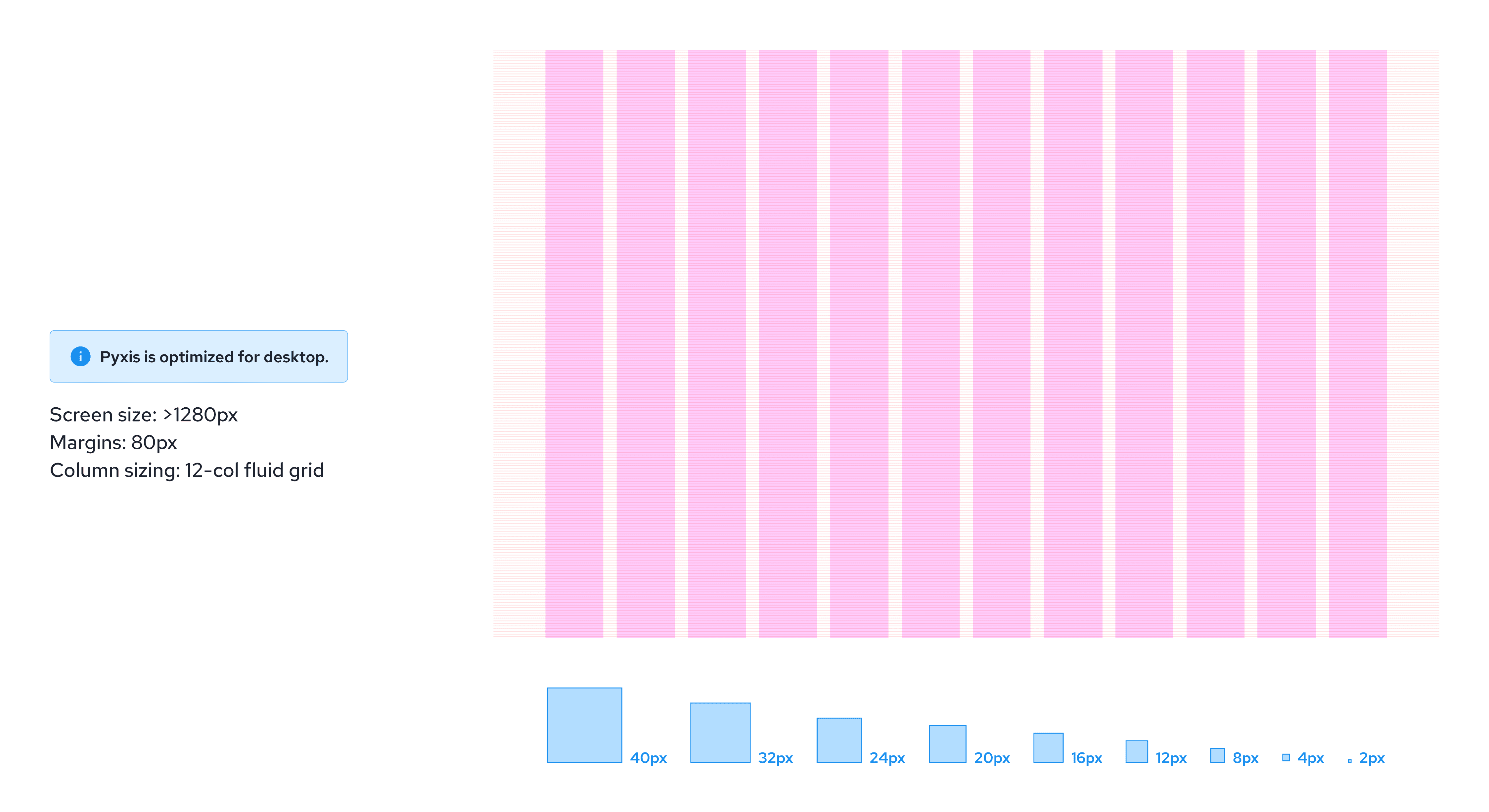
I used an 8pt grid system to accomodate compact components for a utilitarian platform like Pyxis. This allowed design to develop UI consistency regarding padding, radius, and margins. For speed and consumer needs, Pyxis is built for desktop only with minimal responsiveness until there is more data articulating the need for breakpoints.
Snapshot of Components
Tags & Badges
Tags were notably used for a submission workflow and consisted of arbitrarily chosen colors. I expanded the color options to create multi-purpose colored tags useable for different contexts where there are no known dependencies on color semantics. The exception is the submission workflow in which color is applied psycologically to associate with review, published, and rejected states.
Modals
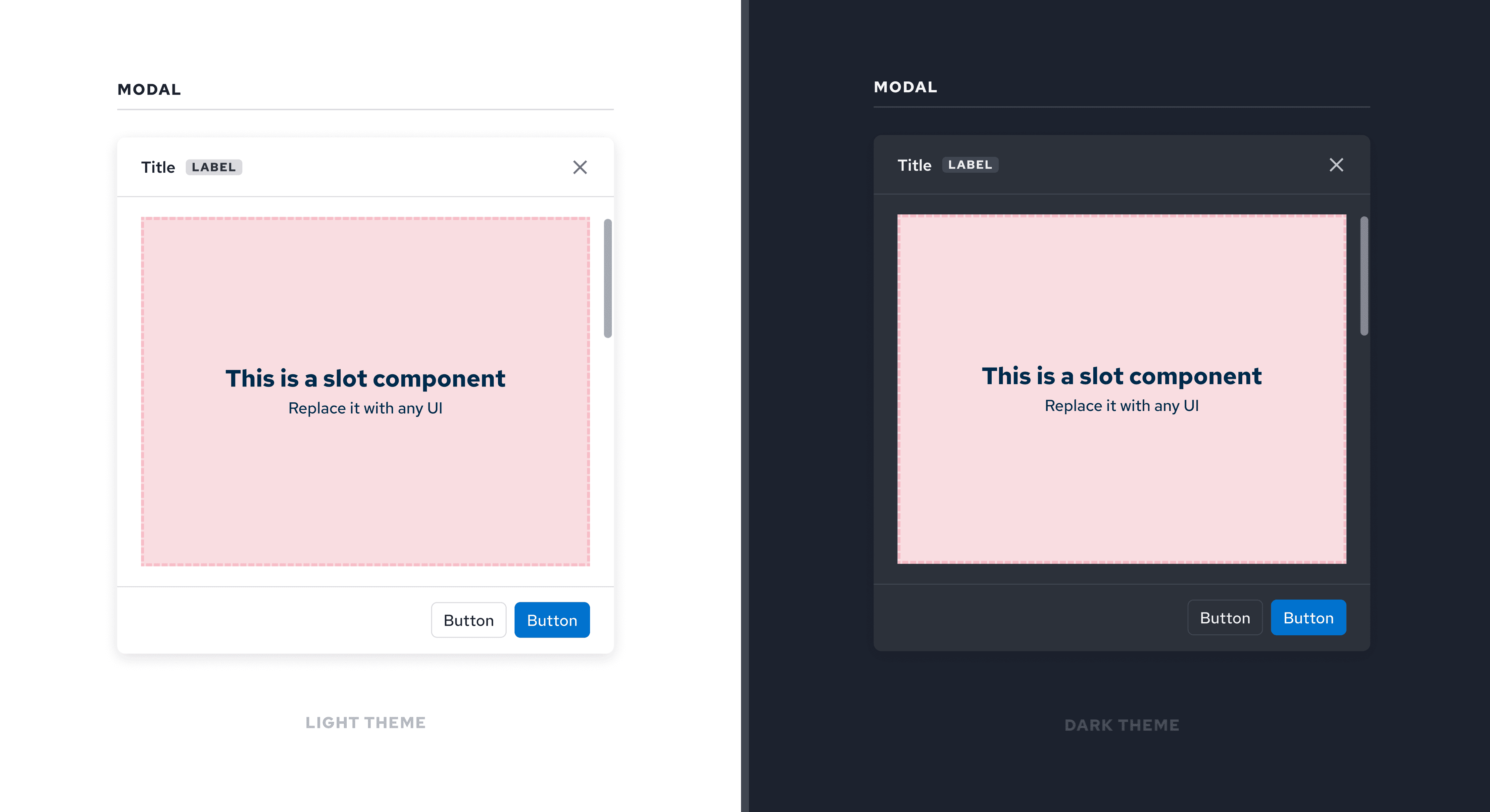
The previous modal did not have inline scrolling or vertical max-height within the viewport. To mitigate this, I worked with the lead developer to build the modal in 3 parts: title, body, and footer to ensure inline scrolling should content exceed the viewport limit. The title and footer remained fixed and sits on top of the body content.
Tables
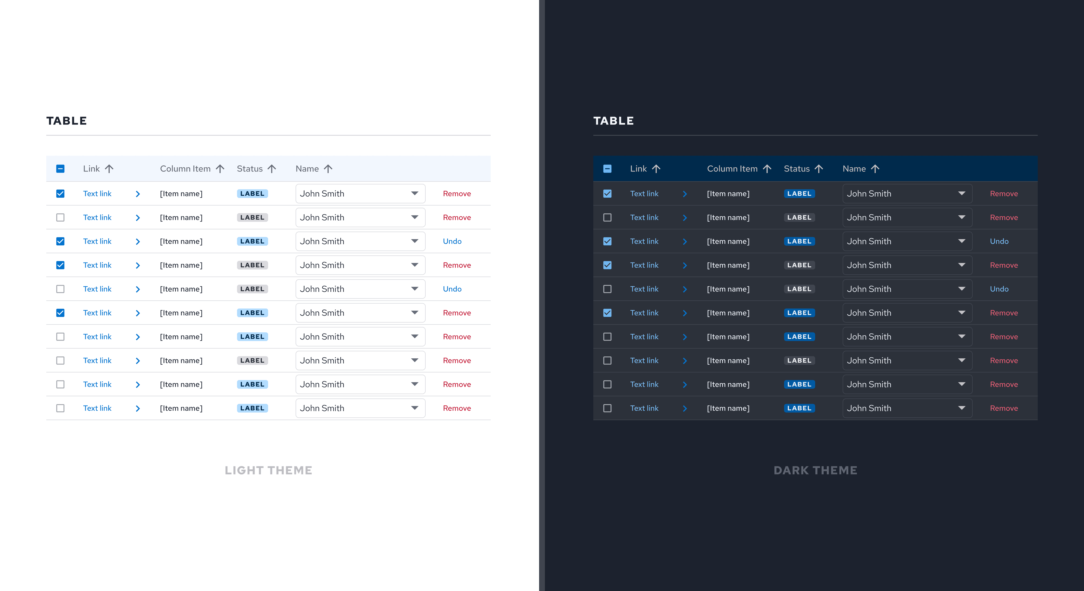
Working with the development team, we updated the table to accomodate fixed cell components including tags, checkboxes, text links, and buttons. Previous iteration of the component had limited cell items. Tables are an integral component of Dominion Energy, housing system and data entries for business and internal consumers.
Future
Moving from a fragmented component library to an async design system required time, culture building, and technical expertise. Before my contract was up, here are a few things that were discussed with engineering during this transition.
Present
Closing the communication gap
Discussions with FE dev about how we create a new process to integrate comms with design system led to a Jira board for design/dev/PM to contribute. A new slack channel for DS comms, and defining a contribution guide for onb new designers.
Future
Coded design system
Building coded components with usage guidelines was the next step, but my contract ended just as engineering begin implementing it in Storybook. In lieu of my leave, I set up the returning designer and lead developer channels of communication to continue the sync with the team.
Future
Adopting color theming tokens
Color tokens have been defined in the DS, but devs still live in Tailwind colors. When dark theme becomes prioritized, the plan is for dev to adopt the color token naming system created by design for update syncs.